Friday, 28 November 2014

Studio Open Days


I attended an Open Day for Arthouse, a Lancashire based interiors company, so I could see how the design team operates. They cover high to low end markets, and produce a wide range of trend-led interiors products including wallpaper, wall art, tiles, room dividers and accessories. I assumed there would be a tour, however it the 'open day' was actually to find new talent. Fortunately I took a selection of my work to show.

'Opera' Wallpaper, above and 'Vintage Plume' Accessories by Arthouse
It was really useful to gain feedback from the design team, who particularly appreciated my use of colour, but thought that my designs were not commercial enough. They gave examples of birds and butterflies as clear subject matter that is currently popular. To learn more about working commercially I asked if they had placements available, and they agreed I could do a placement with them in March. It will be valuable to learn about their process and how trends guide their design work.

MMU's Stockport Marketplace Studios

I also attended an open evening at Stockport Marketplace Studios, a new initiative to allow students going freelance to set up in a supportive, affordable environment.


The studios are fairly basic but there is a good range of designers and artists in residence, which fosters creativity, and the shopfront downstairs allows work to be publicly viewed in a gallery style setting. If I chose to go freelance in future this would be a good studio space and the mentoring scheme and business related talks would be really helpful.


Monday, 17 November 2014

Eduardo Paolozzi

For CP3L I analysed clutter in artists' studios and its effects on their practice, using myself and sculptor and collage artist Eduardo Paolozzi as examples. 

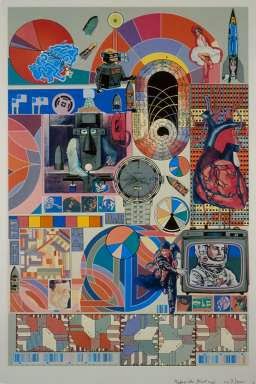
Although generally ordered in his storage of materials, in his work he would place unlikely objects and materials together in unusual (and groundbreaking) arrangements.. He used collections of mechanical parts and scrapbooked images as inspiration and poured his collaging obsession into his work to create new, exciting images.

Paolozzi's 'Bash' Warwick University Website
In my 'Home' project I am also using collections (objects, images, photographs) as starting points, but I allowed list making and de-cluttering (a stress response) to cloud my mind and affect my work. My designs suffered. Through researching Paolozzi's approach, I realised that I need periods of 'mess' in terms of creative thinking and approach, and that physical and mental clutter are distracting and harmful to my practice. As a result I removed personal effects from my home studio, so I have a clear space for making and displaying work. Like Paolozzi, I now use a radio instead of TV to free my mind, fill the silence and block out my to-do list while working.

My studio before and after removal of personal effects
I will stop imposing rules for composition, for example grouping things by subject matter, and be more playful with scale; Paolozzi's images work well because they are unexpected, fun and dynamic, and I need to include these elements in my work. Also I have started including photography alongside drawn motifs, to add a different visual effect; this is something Paolozzi did from an early age, as he enjoyed the combination. Looking at his work has had a definite positive effect on my working practice.


Monday, 10 November 2014

Collaborative Competition

Three of my peers and I decided to work collaboratively to enter a competition. Feathr’s ‘Make Wallpaper That’s Art’ (see link below) was a great chance to respond to a highly relevant brief for me; the task was to produce a repeatable tile (to specified dimensions) that would be used as a wallpaper design. 

We met weekly to discuss the project and show work.

Group members:

Safia Kukaswadia
Krista Murtagh
Leahna Maciocia
Claire Owens

We decided on a Seaside theme, as it suited our research and is a popular current trend. We used a shared colour palette, extracted from our existing Practice drawings; the warm range came from my shell drawing, below, and cool range from Krista's water photographs. The shell has good tonal range and many neutral colours; this should help designs seem commercial yet interesting.

Close up of shell drawing - basis for warm colours

I drew from shoreline photographs I had taken previously, trying to achieve different line qualities and textures to make suitable motifs.


The others drew from various sources, and we shared motifs; each with different styles, and the result was a varied body of motifs; mark making, and linear, textured, filled and photographic motifs.

Motifs: Top and Bottom left, Claire, Centre, Leahna, Top Right Safia, Bottom Right Krista
I worked with the less photographic motifs to achieve a hand drawn feel. I enjoyed using another person's motifs, and felt more free to be experimental as I see this as a side project, with less pressure attached than the Practice Unit. I was less organised and rigid when arranging motifs, and this comes through in the feel of my finished pieces. I am happy with the results and now need to apply this freer approach to my practice work.


My submission to Feathr.com, below, seemed the most commercial, had a good balance of background tones and foreground motifs and had a good sense of movement. Depicting a landscape, I felt that it fulfilled the brief, which directed me to create a design that is not purely decorative and could be seen as art.


Unfortunately Feathr's main competition page has closed, but below is a link for my entry. 

http://www.feathr.com/wallpaper/by-the-sea/

I chose from the context settings provided, (in this case a hatstand) and selected the one that complemented my design in terms of colour so that it wouldn't eclipse my work, and people could imagine the paper working well with everyday belongings in a home. I then asked my social network on Facebook to vote for my design several times to include those who missed my first post. Voting was only part of the process, Feathr will ultimately choose winning entries.

Reflecting on this group project, we gained a high volume of work quickly, introduced different colours and more variety into motifs than if we had worked individually, and worked well as a team to include some of everyone's ideas. It was a really positive experience, and I would enjoy working as part of a design group again.