Wednesday, 13 February 2013

Screenprinting

For me the first day in print room was about experimenting with colour and texture, trying to get used to the technique of printing and seeing how my designs looked on fabric and in colour.

I like the patchy feel of the brown shape below, contrasted with the smooth bold look of the other nearby shapes. In the left hand arrangement I tried to not just create a simple repeat pattern by overlapping some shapes and having each set at different angles, but after discussion with Sally this clearly has not gone far enough; each shape could be in a different direction, different colours, and the overall feel of it less ordered.


In the left hand test piece, the layering of the green and brown circles works well, as it creates a sense of space, and the illusion that the green circles are far behind the brown ones. The outlined brown circles on the right are the most interesting to me, as they show different textures in one circle. For the moment though, Sally advises to stick to bold images and concentrate on colour and placement rather than texture, as it is easier to replicate solid colour and it helps to make these samples feel more vibrant. To make my pieces interesting I agree that I need to focus on placement and feel more, and since my initial image has a striking, bold quality, block colour is highly appropriate here.

Photoshop Colour Work


Initially I didn't think I would enjoy using computers to generate images and ideas as they can be used to make overly worked, soul-less pieces. However I now see programmes like Illustrator and Photoshop as tools to enable me to try out ideas quickly, with a colour palette that can be easily referred back to. By avoiding use of pre-set brushes and colours, it is possible to make personalised work, and as long as I'm careful to use it as an aid and not rely on it as a basis for ideas, the results should remain interesting.

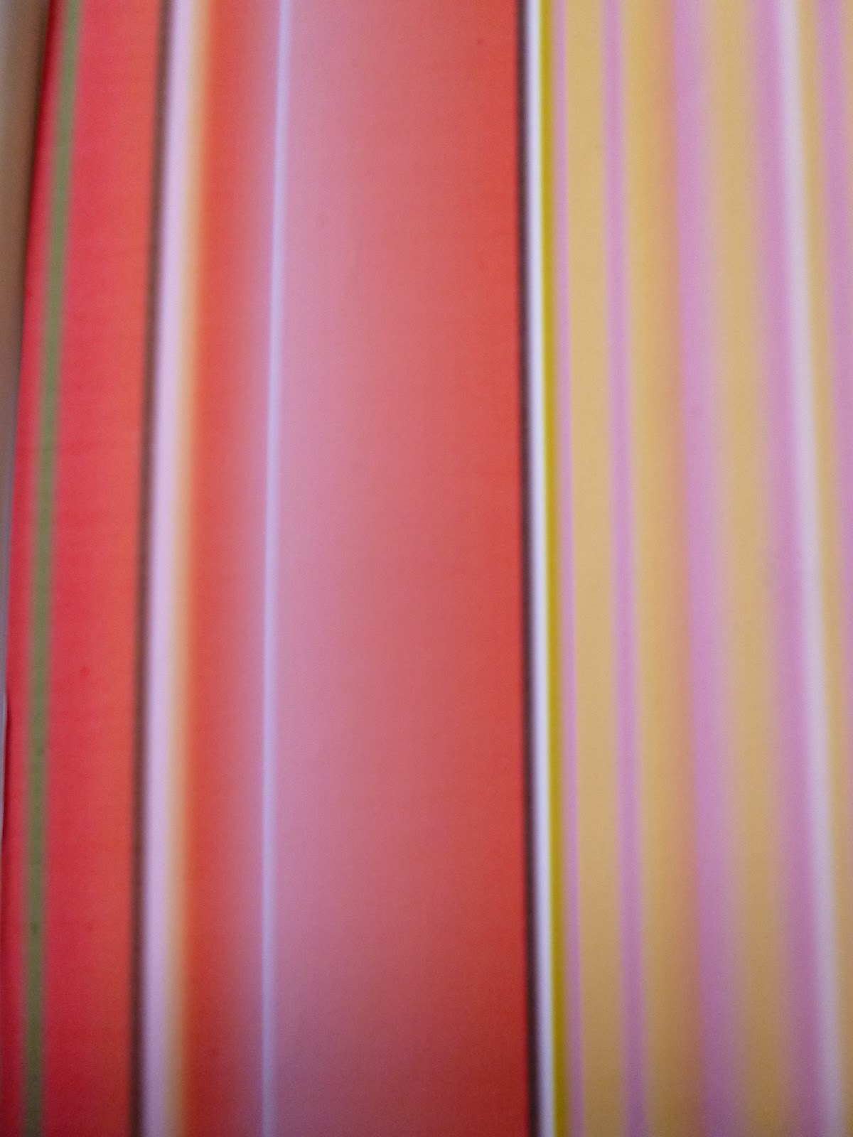
Looking at colour, I made more suitable colour stripes that really helped me to focus on the predominant colours in my image. Also, gradients helped to split up the colours and made me less afraid to be bold. I selected images that hadn't been put on to screen to use to make custom brushes, and played around with scale to liven up my work.


The right hand image here  is an early test of how gradients alter perception of colour and what the colours look like when placed next to each other in different shapes.


I began to experiment with layering up different colours, while trying to retain accurate proportions when compared with my cake photograph. This created more exciting and busy effects, which still have delicate features but are bold and eye catching. 


Tuesday, 12 February 2013

Colour Stripes

Looking back through photographs I had taken in the past, the 2 most striking ones were of a peacock at Heaton Park and cake from a Sydney bakery. Both have bold colour, but opposite moods. I decided to use the cake, as it shows a wider colour range and felt more exciting.


I enjoy mixing paint, and feel that I can create the tones needed to match a photograph, so from a colour point of view my stripes fulfil their purpose. However, Sally pointed out during a tutorial that another prupose of them was to see how blocks of colour sit next to each other; my stripes emulated the original ones I made before christmas as an exercise, and although they are detailed and proportional in terms of colour are dispersed and thin. So the photograph actually provides a better frame of reference for colour proportion. In future I will focus on the different purposes the stripe will have and create it accordingly.


Friday, 25 January 2013

Monday weekly lecture 1

The part of this lecture that grabbed me most was Florian Krautli's magnetic curtain. Innovative and versatile, it can form many different shapes, meaning you wouldn't need or want to replace it as quickly as you might with a conventional curtain. Looking on his website, there are many intriguing ideas, some of which work better than others though all are conceptually fascinating. One of my favourites is 'For the birds', a series of lampshades which are made from natural ingredients including tapioca; as a result when the owner wishes to dispose of it they can simply hang it from the nearest tree and the birds will feast on it until it has been demolished. It's always good to see intelligent design which is forward facing and eco friendly.


Illustrator motifs

Although I was hesitant about the idea of drawing using illustrator, I quite enjoy it and realise how useful and quick it can be when trying out combinations of basic shapes and colours. I wouldn't use it all the time, as hand drawn images have a lovely texture and feel to them, but illustrator can deliver the happy accidents that often happen with manual drawing, adding an unexpected twist.

After the initial session I went through my images to imagine how different shapes could be formed, and tried to find fairly simple, bold ones to begin with. Modified from my original hand drawn designs, I think they have quite a good energy about them, with movement and interesting details. It should be interesting to see results from printing with these motifs.


Motif formation

When discussing my drawings with Sally, she explained that for a motif to be successful for screen printing, it must have a good black and white balance, interesting edges and not be overly linear. I began to draw in a different style, mainly with fine liners that would create clear, strong edges and a dark black. 

Based on the bubbles I used a stencil to form circles with reflection marks in the pattern of the orange data marks on most envelopes.

Reflective bubbles
Drawing based on hole punched paper arrangement 
I also revisited the rectangle stencil and combined it with stamp edges to create bridge - like images.


Tackling the bubbles in a new way, I formed a 'splash' motif that is eye-catching and has a detailed edge. The narrow strip of light in the centre would be too narrow to print with on a screen, so I re-drew it with a wider gap to make better prints with later on.


Post Christmas Data

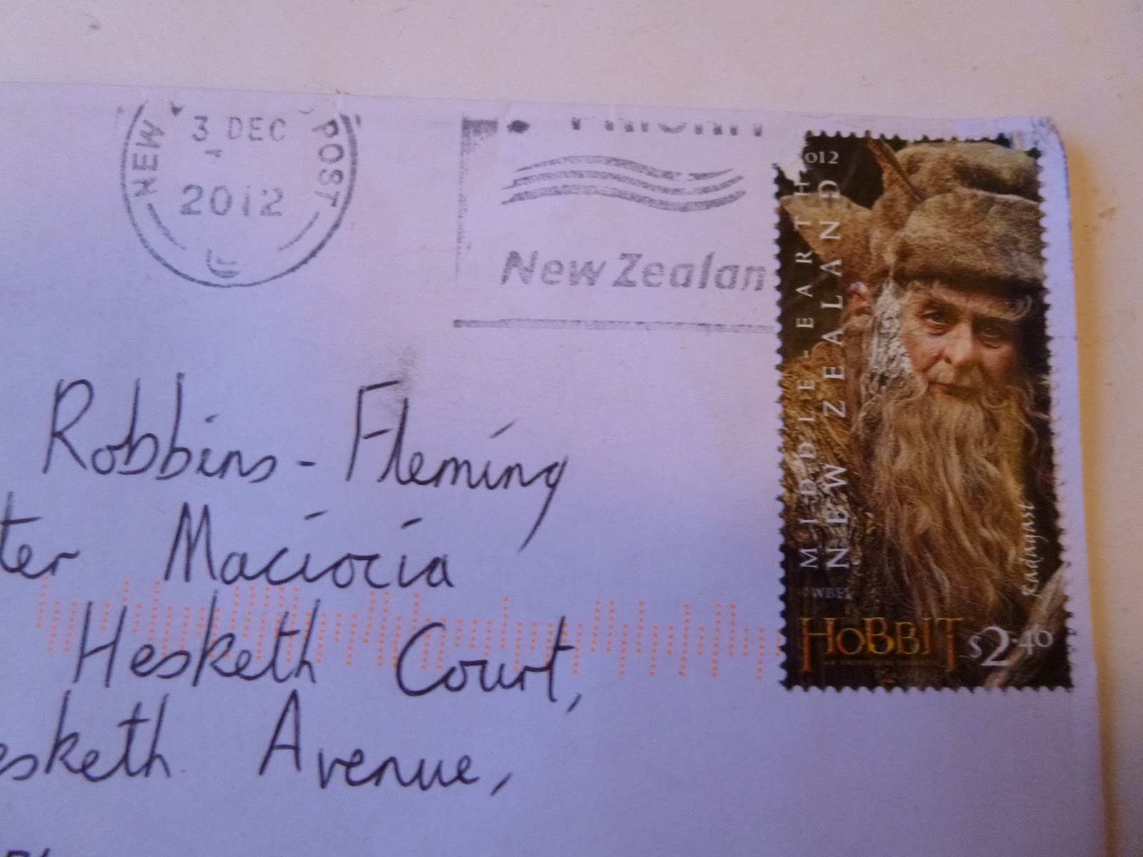
Before Christmas, I started receiving Christmas cards, and the first had an interesting stamp on it; sent from New Zealand, it depicted a character from the upcoming film 'The Hobbit' which had been filmed there. This made me examine the envelope more closely, and I decided to keep it. Soon, other interesting mail came in, with reindeer, and different postmarks and coloured envelopes. I collected them and started to form marks based on them, plotted where they came from on a map to form a pattern, and drew round envelopes. This gave me a good range of images from which to develop motifs.


Stamp edges and postmarks, pencil


Recreating postmarks by drawing round a pritt stick