For the next two weeks I need to focus on choosing pieces for a final collection, making sure that the colours work across the range, that there is a variety of scale and composition and that I use good images from throughout the project rather than just focussing on work from the last couple weeks.
Photoshop tip: More accurately sample colour from a scanned image
Use eyedropper tool, look at the top options, drop down menu, select 'point sample' and increase the number (this is the number of pixels the average colour is taken from)
To Do:
Present context research
Select a few specific surfaces for context images eg. a worktop, cupboard door, washing machine
Finish drawing kitchen/bathroom settings, include a few drawings in each image to set a scene. Can block colour eg. a wall or floor to make it look more like a room and less like a line drawing, make sure that the join between the floor and wall is evident
Play with scale eg. use single large motif across the side of a bath
Try more photoshop pieces with black in the foreground
Tweak gold (yellow) and green colours in existing photoshop work
Go through projection/light cave photos and choose some for final pieces; may need colour alteration/cropping
Use bondaweb to present light blue fabric samples
Add tech info to print room samples
Mount print room samples with headers
Organise all project photos on USB stick for submission
Monday, 11 November 2013

Friday, 8 November 2013
Print room Flock, 7th Nov
Today I tried flocking for the first time. The colours available were appropriate for my palette and I wanted to add a different texture to my designs.
The first (blue) sample turned out a little uneven. At first I wasn't sure if this was an illusion; the flock on the discharged white parts of the fabric seemed thinner, and the untouched black parts of the fabric thicker. This effect, although technically incorrect, still fits in with the TRON aesthetic and give the impression of movement. It was in the press for 30 seconds, and I used 6 pulls of the squeegee with the Texiflock LL glue.
 |
| uneven flocking still gives a TRON-like effect |
To rule out the colour of the fabric underneath the flock as a reason for the patchy finished look, I pigment printed onto the white shape in red before adding the red flock on top. I didn't iron the pigment before adding the glue, which I probably should have done. Again, the sample went into the press for 30 seconds but this time I used 8 pulls in different directions.
 |
| large lace/animal shape after discharge and pigment print |
 |
| large lace/animal shape after discharge, pigment and flocking |
 |
| uneven laying down of the flock, gives an interesting effect |
For the third and final flock sample I used 8 heavy pulls in different directions for the glue, and realised that the flock paper wasn't coming off easily enough after 30 seconds, so I put the sample back in the press a second time (total of 60 seconds in the press). This produced a much stronger result. Again this was done over an un-ironed red pigment base. Although there were a couple of small areas that were difficult to peel off, the overall look of the result is bold, bright and definitely TRON-like.
 |
| lace/animal shape after discharge printing |
 |
| lace/animal shape after discharge then pigment print on top |

 |
| lace/animal shape after discharge, pigment and flocking |
 |
| raised surface |
Tuesday, 5 November 2013
Monday 4th November Tutorial
This week we were encouraged to go through all of our work from the start of the project, and select some pieces that may be suitable for final designs.
Also we need to choose some contexts for our designs (providing our own photographs of these or drawings) and start putting our images into them. I had thought about relating the reflective nature of my work to the context it is presented in by displaying it in a sleek kitchen, with shiny surfaces or as something related to light like a lampshade or blind.
If using curtains or layered pieces to showcase photoshop designs we should provide samples of the material that we would have them printed onto to indicate the desired feel of the finished product. For something like wallpaper, it is enough to research people who produce their work in a similar way.
The mixing of processes in the print room is starting to work really well; discharge, pigment and foil printing give a good range of textures and colours on dark backgrounds. Where illuminating discharge was used, the edges of the motifs seem pixelated and the colour sits perfectly within the shape. It looks quite clean-cut. As a result of fabric shrinkage with the normal discharge process, the pigment can't sit exactly on top of the dye-stripped area and so a stepped effect results. I like both approaches, so will (time allowing) use more illuminating and plain discharge dye.
Layering images up in the print room works well but is very time consuming even when working on several samples at once; in future I might group more images together on screen, so that I could still print with them individually if necessary, but when used in groups the printing process would be faster and I might be more productive.
To Do:
Go through all print room samples, order them
Cut them to roughly A4 size with sellotaped edges
Write print room notes next to them
Go through photoshop work, order them
Print photoshop samples
Write photoshop notes next to them
Scan print room work into photoshop to extract colours
Produce further photoshop samples, ? try out repeat
Produce context images
Insert selected work into them
Research artists working in that context
Produce further print samples - discharge, discharge illuminating, foil, pigment, can paint in discharged areas with reactive, flock.
Use foil outlines, try them with fabric glue and press onto fabric
Find a textured fabric similar to purple one - nice effect
Select out final designs, present for assessment - Card holder for fabric, Print out photoshop designs, put technical notes in an ordered folder.
Sunday, 3 November 2013
Screen Printing
I was glad to get back in the print room; the business and rhythm of the work suits me well and I wanted to see what my designs would look like in the flesh.
The first day was difficult, my colours didn't show up well even on the lightest of the fabrics I had prepared and so I was not getting the right 'feel'. I then re-mixed the colours with white or made them darker as appropriate and started to piece the images together. I printed over the paler base, and this made it look as if the shapes were 3D, or moving.
 |
| original pink creature below, white-pink ship above |
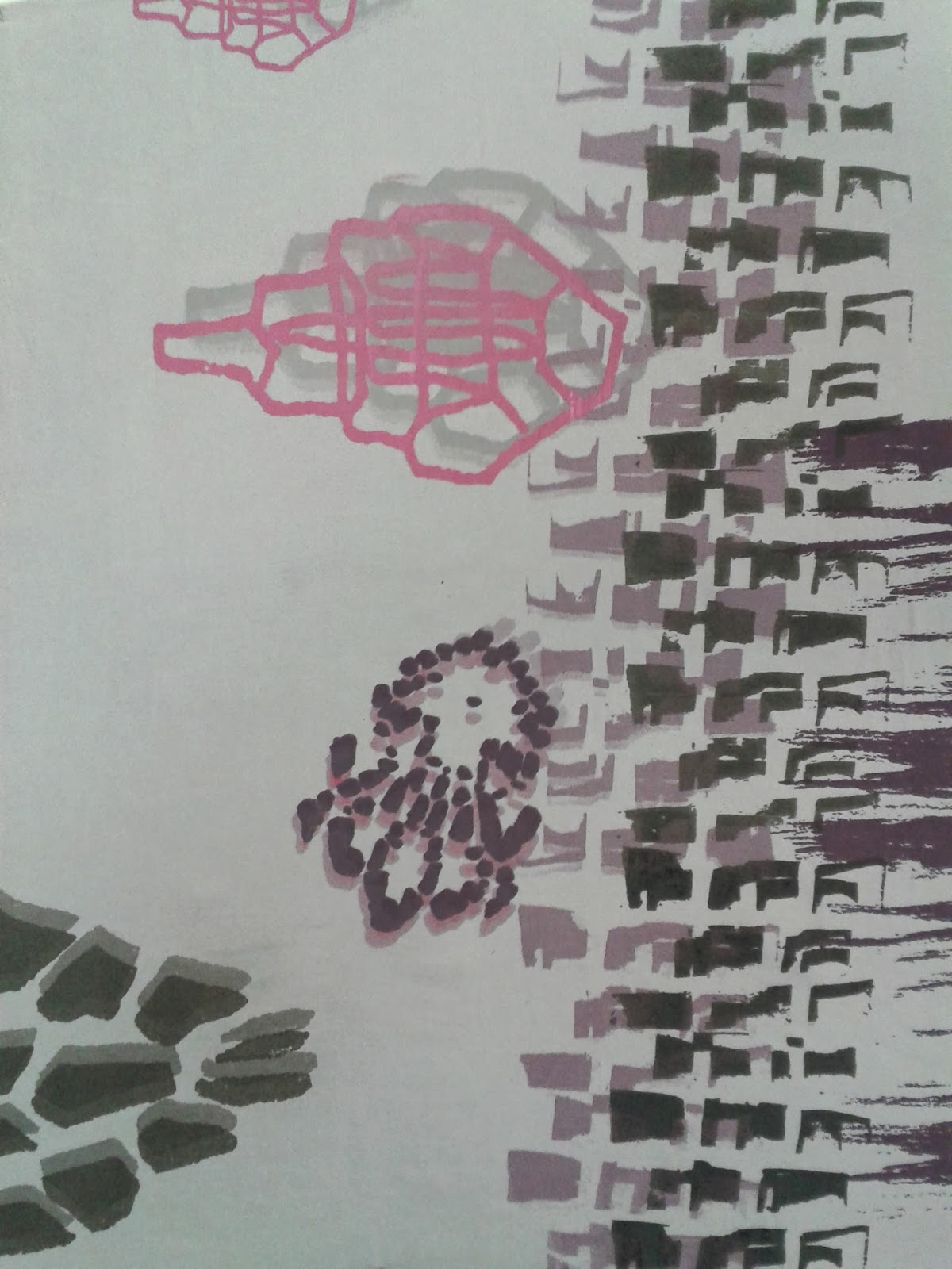 |
| purple over the pink creature worked better. black on top of the purple bricks makes it seem as if it is moving |
I thought I should try a brighter background as well and it definitely adds the intensity seen in TRON. Again, the original dark grey lies below the black, successfully adding a sense of movement.

To work on a black background I realised that discharge printing was the most sensible option. This worked well and provided good contrast. When dry, the fabric had shrunk slightly, so the images on the screen no longer fit perfectly over the white shapes created by the discharge. This led to the shapes overlapping, and a slightly edgy effect which again suits the atmosphere of TRON and Daft Punk well.
 |
| Before steaming and washing |
 |
| After steaming and washing with pigment print on top |
 |
| The blue dye shows up green after one steam. |
 |
| After 2 steams and fixing by washing and drying. It needed an hour in the steamer for the second steam to turn fully blue. |
To bring a new shiny texture and light to my designs I began to experiment with using foil. With 6 pulls of the Texiflock ST glue through the screen and 30 seconds in the heat press, the top layer peeled off easily and the images were clear. I tested small pieces first of all to make sure that this would work on the different fabrics. I quite liked the pieces left behind; they form a negative image of the one on the screen, and could also be used on fabric. I could trim round the edges closely and try using small amounts of fabric glue to stick it down, before putting it in the press.


I chose certain shapes for foiling, because they would mimic a shape already there, add another colour, move the viewer's eye around the fabric or to bring it out compared with the other ones.


 |
| Where there are 2 or more different foiled shapes in one sample I put them in the press multiple times. This didn't spoil the appearance of the foil and meant I could modify things as I went. |
Monday, 28 October 2013
28th October Tutorial
Alex had a few suggestions to take my work further:
Print some of the photos from the foil cave A3 size perhaps and print on top of them
Could use pigment through a clear screen with clear medium to create the cloud - like backgrounds which I could print more graphic or linear images on top of
Could use white to mix pigment with to keep the bright colour
Foil should be fine on top of or under pigment as long as pigment is fixed before putting foil on top
Reactives might produce good colour but have poor reproducibility
Draw some electrical objects; I had said I might do this with the OHPs themselves as they are quite sci-fi looking, so think about what I could draw
Make sure I have a variety of images, some busy, some quiet, some large, some small scale
For tech file, need notes next to actual fabric samples and photoshop designs, focus on effects I like or new ones used, how things are fixed
Try and narrow down a context for final designs - cushion, wall hanging, tea towel, furniture cover? I think something found in the kitchen might be good because of the shiny look and reflective nature of taps, ovens etc. though equally it might be interesting to subvert this idea and bring shine to the livingroom
Can have a mix of photoshop and fabric samples for final pieces, 8-10 things including context images
Print some of the photos from the foil cave A3 size perhaps and print on top of them
Could use pigment through a clear screen with clear medium to create the cloud - like backgrounds which I could print more graphic or linear images on top of
Could use white to mix pigment with to keep the bright colour
Foil should be fine on top of or under pigment as long as pigment is fixed before putting foil on top
Reactives might produce good colour but have poor reproducibility
Draw some electrical objects; I had said I might do this with the OHPs themselves as they are quite sci-fi looking, so think about what I could draw
Make sure I have a variety of images, some busy, some quiet, some large, some small scale
For tech file, need notes next to actual fabric samples and photoshop designs, focus on effects I like or new ones used, how things are fixed
Try and narrow down a context for final designs - cushion, wall hanging, tea towel, furniture cover? I think something found in the kitchen might be good because of the shiny look and reflective nature of taps, ovens etc. though equally it might be interesting to subvert this idea and bring shine to the livingroom
Can have a mix of photoshop and fabric samples for final pieces, 8-10 things including context images
Friday, 25 October 2013
25th Oct 'Foil Cave' and OHP experiments
To get some more interesting images and backgrounds to work with, I used 2 OHPs to combine some of my acetate images with objects. I feel like they're starting to work well, as the colours are more TRON-like and there is a range of textures present.


I like that the solid shapes of the floppy disc (left) and lace stencil (right) have been 'filled' with other marks or drawings, and the images are quite graphic with the bold black lines.
I also draped the OHP with foil to create a dark cave, which was then lit with LEDs and laser finger rings to encourage reflection and interesting light effects. I then photographed this and added shadows or highlights using Picasa. The folds in the shiny foil create crisp lines which contrast well with the diffuse light patterns. I started to add in objects as well; the circle in the bottom right image is from the inside of a floppy disc.


I also cropped small sections of the images to create backgrounds that I can use for photoshop designs. I can layer lighter or darker brushes on top as appropriate to get the right feel. Some of them may look better as they are, but I think it's worth doing a few experiments to find out.


Thursday, 24 October 2013
Thursday 24th October Careers Advice Lecture
Takeaway points from this lecture:
It's never too early to network or apply for placements. Make a linkedin.com profile and a CV.
Networking just means informal fact finding; getting people's contact details, asking them for their experiences, advice on presentation, usepful people to know and vital events and asking about work placements or short term project work. This may or may not lead to a job.
When meeting someone, SHINE, C!:
Smile
Handshake
I contact
Name
Enthusiasm
Contact Details!
There are many ways to find info about careers, networking, placements and jobs:
HUB Careers service (open easter and summer and can be used up to 3 years from graduation)
Craft Centre Northern Quarter artists
www.prospects.ac.uk
www.ucreative.ac.uk
www.arts.ac.uk/student/careers
www.skillset.org
www.chb.com
www.csd.org.uk
www.texi.org
www.interiortextiles.com
www.designdirectory.co.uk
www.artsthread.com
www.jotta.com
www.ctdg.org.uk
www.machestercommunitycentral.org
www.creativeindustriestrafford.org
www.creativetimes.co.uk
www.meetup.com
If wanting to go freelance:
www.thedesigntrust.co.uk
www.nesta.org.uk
www.mihmentoring.com
flyingstartonline
www.innospace.co.uk
www.artdes.mmu.ac.uk/designlab
Things employers will look for: COMPETENCE
Commercial approach - idea of costs, pricing etc.
Organisation of an event or group of people
Masterclass attndance
Passion for design, involvement in arts scene
Exhibitions, competitions entered
Team working skills
Experience - placements, internships, residencies
Negotiating and influencing skills
Community work
Extracurricular projects, work, hobbies
Subscribe to:
Posts (Atom)