Monday, 12 May 2014

Colour, Motifs, and Clarissa Hulse

Colour Palette

I created a colour palette using photoshop, based on my research photographs and drawings. I looked at the colours Digetex provided for the camouflage board when choosing them, and tried to get a range of warm and cool colours so I can create designs that differ from each other in terms of mood. I gave the colours relevant unique names so they will be easily identifiable in future, as I would if my designs were being put into production by a client.


Brush Motifs

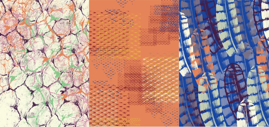
I made a large range of brushes to use so that my designs will not be too repetitive. Before starting to form images on photoshop I tested each one to see how it lays down colour and to see exactly what I had to work with. This really helped when it came to composition, because the motifs were fresh in my mind so I knew which one would, for example add a grainy texture or sharp edge. These are some of the brushes I made; for some I tested them with one click, and then with several to see the contrast. Again this helped to save time later on.


Photoshop Designs

I began to experiment with colour and composition, and produced designs of varying complexity, each with their own form of camouflage. All are quite busy, so best suited to digital design, and use a range of colours, in a deliberately bold or subtle way. I think they work well, and could form part of a collection despite the different emphasis for each. In previous projects a weakness was a lack of variety when it came to the scale of my motifs, so here I tried to use medium, large and small scale ones respectively. It adds another dimension to the work and extends the range of the collection.

Left: some shells are negatives of others, a subtle form of camouflage
Middle: shells ad feathers become palm leaves, and butterfly wings are parasols
Right: Texture and colour are used to conceal this sea urchin-like motif,
which itself is actually a sea sponge  
Left: experimenting with spacing of motifs and colour combinations
Middle: layering textures to see what works well and what new shapes can form
Right: the purple motifs are actually negatives, which isn't obvious straight away
Motifs for Screen

At first when choosing motifs for screen printing I picked my favourites from my digital designs, and used far too many. I narrowed them down, but after talking with the technician from the fine art (paper) side of the print room I realised that I couldn't use my usual technique of printing several different motifs from one screen onto different pieces of fabric before cleaning it. This is due to the much shorter time it takes for pigment to permanently block the screens on the paper side. This meant having to go back through my motifs and choosing them in a different way, prioritising easy coverage and pulling through, and increasing scale. I picked out the simpler photoshop designs and used the motifs from them for my screen selection (see below). There are 6 motifs, each A3 in size. This should help to achieve coverage quickly.

Both examples are simple in terms of motifs (2 each) and colours (3 each)
Final choice of screen motifs, 2 of which will provide background texture

I also needed another (quicker) way to form a background; rubbing wouldn't work on good quality paper, and line drawing or printing would take too long. Looking back through my research drawings I realised that watercolour would be a good solution as it is quick and provides a contrast to the defined edges of motifs on screen. Watercolour paper which is durable and able to take paint, and also has a slightly textured surface that I could always work into afterwards if needed. I still wanted to keep the printing to a relative minimum so picked out simple, bold photoshop designs and used the motifs from them for my screen selection.

Clarissa Hulse

I looked at a screen print designer called Clarissa Hulse, (also on Teresa's suggestion) and her work is really inspiring; she uses colour in a bold, fearless way and uses natural subject matter elegantly to form shapes and stripes. From a distance it isn't clear what the shapes are, and because of the bright colours you wouldn't assume that they are natural forms. This fits in well with the idea of camouflage and shows that a few motifs can go far if they are presented in an interesting way. Her work encouraged me to be highly selective when choosing motifs and to be less afraid of using vibrant colours together in my designs. Hopefully I will be able to carry this through into the print room.


Thursday, 24 April 2014

Chester Zoo Visit and Thomas Bewick and Drawing


Chester Zoo Visit

In order to take more photos of animals who blend in with their environments but are still distinctive, I visited Chester Zoo during the Easter break. It was a sunny day so the light was great for taking pictures, and the colours and patterns of the animals stood out really well. My colour palette will be formed from a combination of these photos, those from Manchester Museum and my drawings of the animals and specimens there.


From Left to Right: an Okapi is a hybrid of zebra an deer/horse,
a colourful fish blends with rocks, cheetahs' coats are highlighted in sun,
a lizard hides amongst foliage and a snake's skin provides camouflage
Thomas Bewick


Teresa suggested I had a look at Thomas Bewick's woodcuts, and I find them really interesting; he creates shapes and textures just by using small line strokes, and draws animals as if they are made up of segments rather than looking at them as a whole. I have started to do this with my research material; while at the zoo I was looking for patterns and shapes rather than at the whole animal. I would like my designs to have this slightly segmented feel, as it adds movement and keeps the viewer interested.

Even the name given to this print of a giraffe is a mix of different animals - the way Bewick sees it, camel and leopard are brought together to form a giraffe, and this thinking is evident in his work. This also reminds me of the Okapi from Chester Zoo, that seems to be a strange hybrid of different animals. I prefer the cameleopard, because of the space at the top of the drawing; it allows closer inspection of the detail, that seems to just get lost with the woodcock below. I need to incorporate such space into my designs to stop them feeling claustrophobic, but still have that sense of having to search out the creature or pattern from amongst the undergrowth.


'Woodcock' and 'Cameleopard' 
I started experimenting with texture using watercolours, as a way of providing a background and quickly making a range of marks. It was difficult to be accurate in terms of shape and colour with the paints, as they are a different colour why dry to when wet. This turned out to be a good thing, as it provides a contrast to the sharp line drawings.

Left: cheetah and bee orchid colours combine with fish patterns
Right: scales from snake skin painted in chameleon and fish colours
To build up interesting patterns and produce marks in a clearer way, I rubbed with crayon, pastel and pen onto different surfaces. These rubbings have been scanned in so I can develop motifs and designs using them in photoshop. I tried to achieve variety in the marks, some larger scale and some smaller, from natural forms such as wood and from walls and concrete. They have a good movement to them, but their use may be limited to motifs for screen and photoshop as the rubbing effect only works with very thin paper.


Tuesday, 25 March 2014

Museum Research, Drawings, Digetex Meeting and Tigerprint Competition

Manchester Museum Visit and Drawings

To get some more first hand material to draw from and do some quick sketches and drawings I took myself to Manchester Museum. I tried to be selective but capture a variety of specimens and live animals in the vivarium. Many creatures there are not what they seem; fossils and skeletons don't resemble the living animals they came from, and sea life often mimics its surroundings. Even coral resembles a brain, or labyrinth. One bird, the golden pheasant seems to be a strange construction of several different animals all in one, and has interesting colours and markings. The museum is a really good resource and I'll definitely go back there.

Brain-like Coral and Patchwork-like Golden Pheasant
The butterfly collection is amazing, brightly coloured and there are so many different species. Many of them look like other animals or plants. The most striking is one that resembles an owl. In the vivarium were similar ones, and one in particular stayed still for a long time, so I sketched it.


From Left to Right: Owl-like Butterfly, Butterfly Detail drawn with Pen and Water, Butterfly Quick Sketch and Photograph
In the vivarium a lot of the animals are bright, but manage to remain hidden in the undergrowth because of their small size; a poison arrow frog seems to form the centre of a large plant, easily passed over and I looked for it along the soil and in the water before thinking to look there.


My favourite animal to observe was the chameleon. Its movement was unusual and jerky and its colour changing properties are great to watch in action. This chameleon was relatively inactive compared to one I had seen previously; this was useful for sketching but I still had to be fast! Some patterns formed by its scales were surprising; red spots for example. Its tail mimicked the branches and shoots from the foliage. I don't usually sketch quickly, so was apprehensive at first but the animals' movement forced my hand, and I realised the limits of what I could achieve in the short time I had before they moved. This helped me discard visual information, and focus on the essentials, so these quick drawings have a different feel to my usual slower ones. I really enjoyed it as well, which was surprising, so I'll do more like this in future, perhaps trying out this technique with something still so I need to rely on myself to set the quick pace. This should be a good challenge and will push my work on.


Top: I tried to capture its character with a quick pencil sketch; it stared straight at me
indignantly as if to say 'What are you looking at?!!'
Its markings were bright and unusual so I noted them with coloured pencil
I started to use my photographs as a basis for line drawings on tracing paper; this way I could overlay them with backgrounds later. I focussed in on the detail and the bright colours found, and tried to draw in such a way that the original animal was not obvious, for example a sea fan became tree-like and a sea sponge resembled a sea urchin when drawn in a simplistic, linear way.

When drawing I tried to keep the intricacy of the sea life, but in a modern graphic way

Digetex Meeting

Debbie came in to see how we were getting on, and had a quick look at our work. Her main suggestions were to think big in terms of scale, and to bear in mind that print designers are starting to consider outside space more, such as parasols and garden furnishings etc. Also our designs could be put on the side of a building! As someone who usually works to a small scale this was daunting but I want to try and push myself and see how I work when the scale is larger. I thought a garden shed might be a good context for designs, as it plays in to the general vintage trend that has been ubiquitous for the past decade; instead of shed, read british beach hut, and instead of garden chair read deck chair. Print has started to be used on many different surfaces, so bringing fun into the home is the current focus; bringing fun in to the garden is likely to follow. This really gave me a push in terms of thinking about my final outcomes, and I realised tat whatever I design has to stand out and compete with the assortment of colours found in a garden.

Tigerprint Competition

To keep my photoshop skills fresh I entered the monthly Tigerprint competition. This month's theme was Black and White. Out of the 5 designs I entered, the first below was shortlisted. They chose 85 out of 1400 entries this month for their shortlist, so I was really happy to have one of mine among them. I used a mixture of motifs from my previous Tron and WWII projects, and stuck with a stripy theme. They were quick to make as the brushes had been made already, and having a set theme helped with composition.


Shortlisted Design

Other Submissions


Thursday, 20 March 2014

Print and Pattern Research and Lisa Stannard Talk

Initial Research

Using the boards provided by Digetex, I have chosen to focus on CAMOUFLAGE as my main theme, and intend to delve into other such as SILHOUETTE, PAINT EXPLOSION, and GEOMETRIC. I may end up using others, especially techniques such as watercolour and linear drawing.

For camouflage I first thought of animals who blend into their environment, but researched online and watched some DAVID ATTENBOROUGH documentaries and found species that impersonate other animals, such as a butterfly that mimics an owl and a caterpillar that cons ants into looking after it by emitting certain pheromones. I also looked back through my photo archive and found pictures of chameleons, famous for camouflage but actually change colour according to mood, and objects such as phone box fish tanks and trees that have been yarn bombed that are not all they seem on the outside. 


There also are scorpions that glow under UV light and appear completely different. The idea of being hidden and masks is quite interesting, the contrast between perceived look or function and actual purpose. This could come into my work in some way later on. In terms of colour I plan to go through my photos and come up with a relevant colour palette, that incorporates the bright colours that some animals use to blend in with flowers or coral for example. I also plan to visit Manchester Museum to take some more photographs, and generally look out for objects masquerading as other things or that aren't quite what they seem. I also realised that this concept was a part of my previous project 'Sinister Vintage' where motifs taken from war memorabilia were made to form pretty patterns on initial inspection.

For our first tutorial we had to put together 2 development boards, one focussed on theme and one on context/relevant artists. I haven't really put together boards before, so I tried experimenting with layout on photoshop. The grouping worked quite well, but looking back on them I feel like I need more space in between them and generally fewer images. I could also show which images are more important by increasing their scale. Also I could have less text, and rely on my blog to explain my approach and intention. For the context/artists board (top) only one wallpaper company actually provided a context image on their website, so the rest of the images are block patterns. 


Another artist I contacted for work experience in the last project, Deborah Bowness, produces wallpaper that resembles real everyday objects, and is an effective example of the kind of work I could produce for this brief. 


Lisa Stannard Talk

An ex MMU student, Lisa Stannard came to speak with us about her work as a freelance designer/illustrator. She emphasised that just because you want to follow TRENDS, it doesn't mean that they have to come from fashion, or that you actually have to follow them; they are only a starting point to develop work from. Sources can range from music to food to books, and generally have a good CULTURAL LIFE will enrich your research and work. This is reassuring to me as I like to work from a range of sources and am not worried about strictly adhering to trends.

I asked Lisa to have a look at my development boards (above) as I know they are a weak point of mine. She advised that they would benefit from being less crowded, and to consider overlapping images, and only taking key features from a few of them, eg. cutting out a flower from its background.  More important images could be made much larger and once a colour swatch has been chosen that could be added on as well. Also she suggested playing with text, perhaps using it vertically, and trying out different fonts. To make it look more sleek, I could use the View rulers section in Photoshop to ensure all the borders are the same width. 

I had altered the colour of text used and the way it was used (upper and lower case, blended colour for the word 'camouflage' so it began to blend in with the page) but hadn't considered fonts. Also I now feel there is generally too much text on the page. My layout is better than my single prior attempt with producing boards, but still has a long way to go! Lisa is definitely right in that practice is the way forward. For my next project I will take these suggestions on board and be a lot more selective with my images and themes.


Friday, 14 March 2014

Digetex Visit and Research, and Continuing Professional Development

Digetex Brief

This week we began our Unit X Print and Pattern project and Digetex provided our brief. Using their trend boards as a starting point, we have to produce a collection of print designs. They are a digital print company who produce wallpaper, fabric and promotional materials for businesses and individuals on a bespoke basis. We had the opportunity to visit their base in Trafford and have a guided tour of their offices and factory.

A relatively small company of about 20 employees, (based on those we met) Digetex works with people from renowned designer Matthew Williamson to university students requesting their own designs to be printed on sample sized pieces of fabric. Winning Best Wallpaper Collection at Northern Design Awards shows the scale of their success. In future through their website www.surfacepatternprint.com  they aim to run a selling service; designers will upload their designs, and if a client wishes to buy the print, Digetex will print it out and ship it to them.

The company is structured into four main parts, as seen in our group presentation board below, and each serves a different purpose. Included are images from the Digetex website.

Digetex is a really forward thinking company, who have always been involved with technology; they were working digitally before Photoshop was created. Researching and choosing from current trends they make modern pieces, but they don't forget the past. Antique fabric samples are a source of inspiration alongside more current ones. There is a strong emphasis on traditional image making and hand drawing for research purposes, which is then augmented and updated using digital tools. 

Listening to Debbie, one of the founders, speak about this mixture was reassuring; as someone who likes to screen print as well as produce digital work, I appreciate that not all designers choose to care about quality research and a hand made approach. Also with relation to being forward thinking, she made me see that in order to sell designs you have to give them an edge, for example investigating the use of 3D fabric or conductive material. A combination of hand made and digital work should produce a more rounded, interesting collection.

Working as a group to research Digetex was a valuable experience; we each thought of different aspects of presentation, such as text size, general layout and content, and contributed different shortcuts on photoshop that sped up the process. We worked well as a team from the start, because we organised a set time and place to meet in the very first lecture when we were made into a group, all turned up to this one meeting prepared to contribute, listened to each other's suggestions, set a time limit to achieve our goal, and incorporated something from everyone when producing the final board. I learned that when trying layouts it is best not to arrange images in a simple grid, but to create movement by laying things out in diagonals or on different parts of the page, and that having peers who you trust and are reliable is really important when it comes to producing work successfully.

Continuing Professional Development

To prepare for 3rd year, and having spoken with a current 3rd year Print student about how best to finish fabric samples, I decided to organise an overlocker induction for interested 2nd years so that we would no longer be restricted to finishing pieces with pinking shears or backing sellotape.

Julie the fashion technician kindly agreed to set up 3 workshops for us. The overlocker and baby overlocker are fantastic as far as I'm concerned; they are quick and simple to use, and produce a high quality finish in seconds. The process is considerably faster than cutting fabric to size by hand, and means that even with thinner delicate fabrics the edges can drape and move more naturally. The finished look is more professional and will raise the standard of my presentation.

My sample (rushed as we were short on time) looks a little uneven, and it took a few tries to get used to the correct pressure you need to apply to the pedal; I tended to push too hard and move the fabric through too quickly. When I next use the machines I will definitely practice on spare scraps of fabric first! We were taught how to change the threads and work safely with the machines, so when I next work with fabric I can present samples using overlocked edges.

The corners would still need to be trimmed and hand
sewn but the edges look neat and professional


Friday, 21 February 2014

My Designs in Context

This unit we were advised as to how to present our designs in a more professional way. Below are examples of my screen printed and digitally produced context images.


Thursday, 20 February 2014

Making a Simple Book

To make a small catalogue of my digital designs, I turned to youtube. An easy to follow tutorial on Saddle stitching a book together was very helpful and soon I had a book!

http://www.youtube.com/watch?v=aWHkY5jOoqM

I trimmed the pages to size (when folded) before bookmaking, so that they would line up evenly.

All you need is something to make holes with (an awn is recommended) thread, a needle and a ruler and pencil for marking out points for the holes. It was quick, fun, satisfying, and gives good results, so I will definitely try making my own books again.