Friday, 28 November 2014

Studio Open Days


I attended an Open Day for Arthouse, a Lancashire based interiors company, so I could see how the design team operates. They cover high to low end markets, and produce a wide range of trend-led interiors products including wallpaper, wall art, tiles, room dividers and accessories. I assumed there would be a tour, however it the 'open day' was actually to find new talent. Fortunately I took a selection of my work to show.

'Opera' Wallpaper, above and 'Vintage Plume' Accessories by Arthouse
It was really useful to gain feedback from the design team, who particularly appreciated my use of colour, but thought that my designs were not commercial enough. They gave examples of birds and butterflies as clear subject matter that is currently popular. To learn more about working commercially I asked if they had placements available, and they agreed I could do a placement with them in March. It will be valuable to learn about their process and how trends guide their design work.

MMU's Stockport Marketplace Studios

I also attended an open evening at Stockport Marketplace Studios, a new initiative to allow students going freelance to set up in a supportive, affordable environment.


The studios are fairly basic but there is a good range of designers and artists in residence, which fosters creativity, and the shopfront downstairs allows work to be publicly viewed in a gallery style setting. If I chose to go freelance in future this would be a good studio space and the mentoring scheme and business related talks would be really helpful.

Monday, 17 November 2014

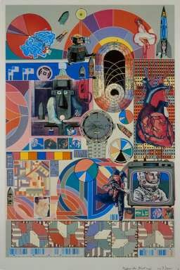
Eduardo Paolozzi

For CP3L I analysed clutter in artists' studios and its effects on their practice, using myself and sculptor and collage artist Eduardo Paolozzi as examples. 

Although generally ordered in his storage of materials, in his work he would place unlikely objects and materials together in unusual (and groundbreaking) arrangements.. He used collections of mechanical parts and scrapbooked images as inspiration and poured his collaging obsession into his work to create new, exciting images.

Paolozzi's 'Bash' Warwick University Website
In my 'Home' project I am also using collections (objects, images, photographs) as starting points, but I allowed list making and de-cluttering (a stress response) to cloud my mind and affect my work. My designs suffered. Through researching Paolozzi's approach, I realised that I need periods of 'mess' in terms of creative thinking and approach, and that physical and mental clutter are distracting and harmful to my practice. As a result I removed personal effects from my home studio, so I have a clear space for making and displaying work. Like Paolozzi, I now use a radio instead of TV to free my mind, fill the silence and block out my to-do list while working.

My studio before and after removal of personal effects
I will stop imposing rules for composition, for example grouping things by subject matter, and be more playful with scale; Paolozzi's images work well because they are unexpected, fun and dynamic, and I need to include these elements in my work. Also I have started including photography alongside drawn motifs, to add a different visual effect; this is something Paolozzi did from an early age, as he enjoyed the combination. Looking at his work has had a definite positive effect on my working practice.


Monday, 10 November 2014

Collaborative Competition

Three of my peers and I decided to work collaboratively to enter a competition. Feathr’s ‘Make Wallpaper That’s Art’ (see link below) was a great chance to respond to a highly relevant brief for me; the task was to produce a repeatable tile (to specified dimensions) that would be used as a wallpaper design. 

We met weekly to discuss the project and show work.

Group members:

Safia Kukaswadia
Krista Murtagh
Leahna Maciocia
Claire Owens

We decided on a Seaside theme, as it suited our research and is a popular current trend. We used a shared colour palette, extracted from our existing Practice drawings; the warm range came from my shell drawing, below, and cool range from Krista's water photographs. The shell has good tonal range and many neutral colours; this should help designs seem commercial yet interesting.

Close up of shell drawing - basis for warm colours

I drew from shoreline photographs I had taken previously, trying to achieve different line qualities and textures to make suitable motifs.


The others drew from various sources, and we shared motifs; each with different styles, and the result was a varied body of motifs; mark making, and linear, textured, filled and photographic motifs.

Motifs: Top and Bottom left, Claire, Centre, Leahna, Top Right Safia, Bottom Right Krista
I worked with the less photographic motifs to achieve a hand drawn feel. I enjoyed using another person's motifs, and felt more free to be experimental as I see this as a side project, with less pressure attached than the Practice Unit. I was less organised and rigid when arranging motifs, and this comes through in the feel of my finished pieces. I am happy with the results and now need to apply this freer approach to my practice work.


My submission to Feathr.com, below, seemed the most commercial, had a good balance of background tones and foreground motifs and had a good sense of movement. Depicting a landscape, I felt that it fulfilled the brief, which directed me to create a design that is not purely decorative and could be seen as art.


Unfortunately Feathr's main competition page has closed, but below is a link for my entry. 

http://www.feathr.com/wallpaper/by-the-sea/

I chose from the context settings provided, (in this case a hatstand) and selected the one that complemented my design in terms of colour so that it wouldn't eclipse my work, and people could imagine the paper working well with everyday belongings in a home. I then asked my social network on Facebook to vote for my design several times to include those who missed my first post. Voting was only part of the process, Feathr will ultimately choose winning entries.

Reflecting on this group project, we gained a high volume of work quickly, introduced different colours and more variety into motifs than if we had worked individually, and worked well as a team to include some of everyone's ideas. It was a really positive experience, and I would enjoy working as part of a design group again.

Thursday, 30 October 2014

Timetabling and Moving Forward with Designs

Between worrying about career intentions and feeling unable to meet my first block November 17th I became stressed and my work suffered; I retreated to familiar ways of working to me (organised, technical exercises) rather than pushing designs and being playful with ideas.

To alleviate pressure and allow time to explore new possibilities within my work I altered my project structure to complete one larger block. Having two blocks encouraged me to work quickly but it clashed with the way I usually work, to combine ideas and processes across a set of collections rather than extracting elements and dividing them up. My plan to complete and present a collection by November was overly ambitious considering CP3L and Spanish run concurrently to the Practice unit, and in future I will be more realistic with timetabling.

Suddenly having extra time, I realised that my project would benefit from more drawing and development. I added to my reservoir of motifs and felt better about the quality of my work. Combining motifs and experimenting with a wider variety of colour produced bold, interesting results (see below). The mood of the pieces was now closer to what I was aiming for; fun, quirky, and homely.

New Designs


Thursday, 23 October 2014

Technical Exercise

After GNCCF I thought about freelancing; to be successful I would need commercial designs and have a good sense for trends and the market. I thought about commercially viable screen printed products I could make relatively easily to the required standard; tea towels and cushions seemed a good solution. I researched fabrics and the type of designs used on them from a selection at John Lewis.

John lewis products


Most tea towels used 100% cotton. Sizes ranged from 45 - 52cm by 70 - 78cm. and prices ranged from £9 - £15. Cushions were £25 - £120, and most were 43cm x 43cm. Linen and cotton (durable, washable, practical fabrics, suitable for everyday use) were most common, and I aim to use these when screen printing according to the sizes above.

The designs were in repeat or placement, and use few colours, with one main motif used. As a result I challenged myself to make designs with limited colour, using 3 similar motifs. It was a chance to experiment with different compositions, use of scale and spacing.


Analysing the 25 designs afterwards, they seemed too similar to each other, and were formulaic. Because of the lack of variety of motifs, I felt stuck for composition ideas and designs ended up too 'safe'. Some could potentially end up in my final collection, but deliberately limiting myself didn't help to advance or portray my full range of ideas.


Monday, 20 October 2014

Competition Entries

I entered Tigerprint's October competition 'Christmas Pattern' to create a repeat design for Christmas themed wrapping paper. I used my Christmas colour palette and motifs from my 'Home' project, and was also inspired by old paper prints and collographs I found while tidying. The leaves and dots' colours lent themselves to the festive theme and had interesting texture, so I scanned them to use on Photoshop. Entering was good technical practice as I hadn't used repeat recently and it will be needed for my wallpaper designs. I was happy with the designs which are bold but not too busy, appropriate for Christmas and commercial.


I observed winning entries after the competition closed, and they were more involved in terms of drawing and use of motifs. This was surprising; usually commercial designs are simple. They also liked use of figures in one design as it was unusual. In comparison my designs look generic; next time I might inject more character and spend more time drawing.

Patternity ran a photography competition as they needed images of interesting pattern to be featured in their upcoming book. I submitted a mixture of old and new photographs and tried to convey different colours, textures and moods in my selection. 


Monday, 13 October 2014

Timetabling, Research, Colour and GNCCF

Timetabling

To allow exploration of a second theme, such as architecture, my tutor suggested that I split the Practice Unit into two blocks. This would enable me to combine blocks or refine one for Unit X. I respond well to structure and deadlines, and expect that having a shorter term goal to work towards will encourage me to work at a good pace. 

Research

To provide a new perspective on objects, I scanned them. To save time I laid them together in a way that was visually appealing to me. This allowed me to see how they interact in terms of shape and colour and see how patterns sit well together despite being quite different.

Scanned Pottery Collected From Beaches

Colour

I extracted colours from my drawings and photographs to form four colour palettes, grouped by theme or colour type (see below). 

Top Left, Christmas themed
Bottom Left, based on my bathroom
Middle, warm colours
Right, cool colours

All share a common mid tone green, and there are also other crossovers so if I decide to use them in combination for digital or screen print collections, they will complement each other.


Great Northern Contemporary Craft Fair

GNCCF was a chance to be inspired by the variety and high standard of work produced by freelancers. I spoke with recent TIP graduates there about starting a business and opportunities they had, and realised I should consider freelancing. To do this I would need to invest time in making, branding, networking and presentation skills. 

I gathered and arranged a selection professional yet enticing business cards to analyse their qualities. Close up photographs draw the viewer in, as you want to see the rest of the product. Although practical to have the maker's name on the front, here the names distract from the designs.

GNCFF Cards
It was clear that each maker's character and passion came through in their products; I need to inject that sense of individuality and fun into my work. I looked back at one finger drawing (based on my bathmat) that really captures this; there is a community of finger-creatures that seem to have a collective personality. By placing different objects together and focusing on their interactions I can create a new, fresh feel to my designs while making them feel homely. 

Bathmat colony